Chernobyl Series Font
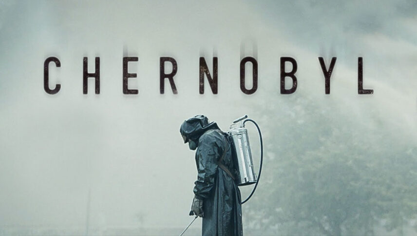
I did a lot of research to find the font used in the Chernobyl logo. I didn’t find the exact font used in the logo. Most likely, this font has been personalized.
Anyway, I found two fonts that are very similar to the original logo font. The first is premium and the second is free. You can manipulate these fonts a bit to make them look like the desired font.
The first font is “Hillstown Sans” and was designed by Letterhend Studio. This font is Premium and you can buy it from the link below.
The second alternative font is “Lionello” and was designed by Edric Studio. This font is free and you can use it in your personal projects. Click on the button below to download it.
The Chernobyl logo font style is very powerful and shows the relative proportion between energy and nuclear explosions and medical texts. Seeing this font is reminiscent of the lessons of chemistry and the structure of the atom, which is found in many scientific books and writings. For seminars, science and nuclear subjects, films about nuclear war can be a huge blast in your design work.
About Chernobyl
Chernobyl’s excellent five-hour mini-series concludes with the words: “Remember all those who suffered and sacrificed.” This is a good ending to a serial that was skillfully made to honor those people, from directors who died in explosions to those who tried to prevent the outbreak, to scientists who rose up to make sure it didn’t happen
Chernobyl, which has a brilliant structure and features amazing roles like Jared Harris, Emily Watson, and Stellan Skarsgard and others, is cruelly cold but has significant growing power. For me, every hour was more engaging than the previous one, because the multilayered Johan Renck view of a whole country that is being changed by a nuclear accident is becoming more and more shocking.
Chernobyl can be a tough product for HBO viewers, who are more drawn to the fictional twists and turns of its recent mini-series, such as Big Little Lies and Sharp Objects.
