Whiplash Font
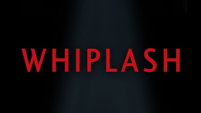
What font is used in the Whiplash logo?
I did a lot of research to find the font used in the Whiplash logo. I didn’t find the exact font used in the logo. Most likely, this font has been personalized.
Anyway, I found two fonts that are very similar to the original logo font. The first is premium and the second is free. You can manipulate these fonts a bit to make them look like the desired font.
The first font is “Charlotte Sans Medium” and was designed by Michael Gills and published by ITC. This font is Premium and you can buy it from the link below.
The second alternative font is free and you can use it in your personal projects. Click on the button below to download it.
If you want to be successful in music and drumming, have a coach like J. K. Simmons, you can become a successful student at the end. Now, if you have the font of the logo of the Whiplash movie, which has a reddish and pungent color, you will finish your project and send it for printing. All you have to do is add creativity and experience to it and use it in action movies, and energizing and, of course, a bit violent.
About Whiplash
Damien Chassell’s unexpected film, “Whiplash” suddenly came out of nowhere and surprised us with the madness that was running through his veins.
Just as in one of the scenes in the film, Trans Fletcher (J. K. Simmons) confuses the music classroom with a military barracks and frightens the young Andrew (Miles Teller) with his sudden screams, slaps, and insults. He destroys Andrew’s character in front of others. But he is not satisfied again. Then, at the height of these tumultuous and astonishing moments, when we think it’s all over, he walks very calmly and calmly across the room, firing his chair quickly at Andrew. The chair appears in a fraction of a second to swallow Andrew’s head. He shakes his head.
But we, who are stunned by such events, remain numb and immobile, and one of the first blows of “Whiplash” brings us with it a painful but the sweetness of mind.

