Los Angeles Clippers Font
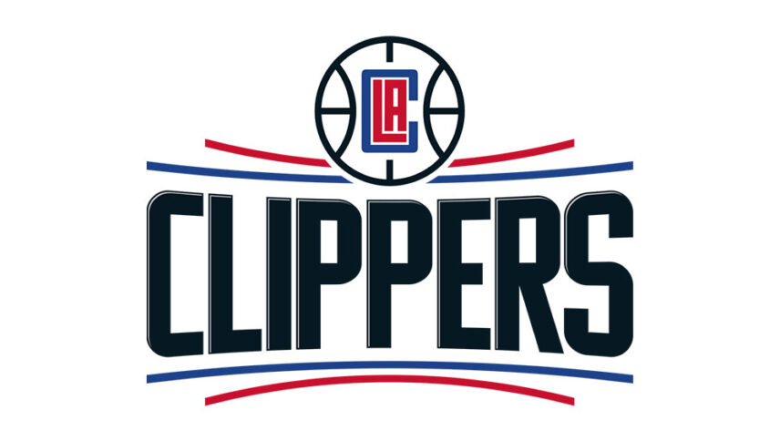
What font is used in the Los Angeles Clippers logo?
I did a lot of research to find the font used in the Los Angeles Clippers logo. I didn’t find the exact font used in the logo. Most likely, this font has been personalized.
Anyway, I found two fonts that are very similar to the original logo font. The first is premium and the second is free. You can manipulate these fonts a bit to make them look like the desired font.
The first font is “Komu A” and was designed by Ján Filípek and published by DizajnDesign. This font is Premium and you can buy it from the link below.
The second alternative font is “Displayed” and was designed by Andika Fez. You can use it in your personal and commercial projects. Click on the button below to download it.
In the Los Angeles Clippers logo font, the wordmark is much larger and more prominent than the emblem. Wordmark is placed between the blue and red lines with a font that has a sporty style and a panoramic effect. At the top is the basketball, in the center of which are the first letters of the “Los Angeles Clippers” word look like a maze. This logo font is suitable for car brands, blue sports, and action movie titles.
About Los Angeles Clippers
The Los Angeles Clippers are an NBA professional basketball team based in Los Angeles, California. The hall is used jointly by the other NBA teams, the Los Angeles Lakers, the Los Angeles Sparks in the NBA Women’s League, and the Los Angeles Kings in the Hockey League.
The team was originally founded as Braves and was based in Buffalo, New York. It then moved to San Diego and then to Los Angeles, but during that time it failed to succeed in the regular season or play. Clippers is often cited as an example of a regular loser in professional sports in the United States because of his not-so-fair comparisons to the Lakers’ proudest team. The new Lakers became known in the Los Angeles basketball market and became a partner of the old team in 1999 in the use of the basketball hall.
