Cold War Font

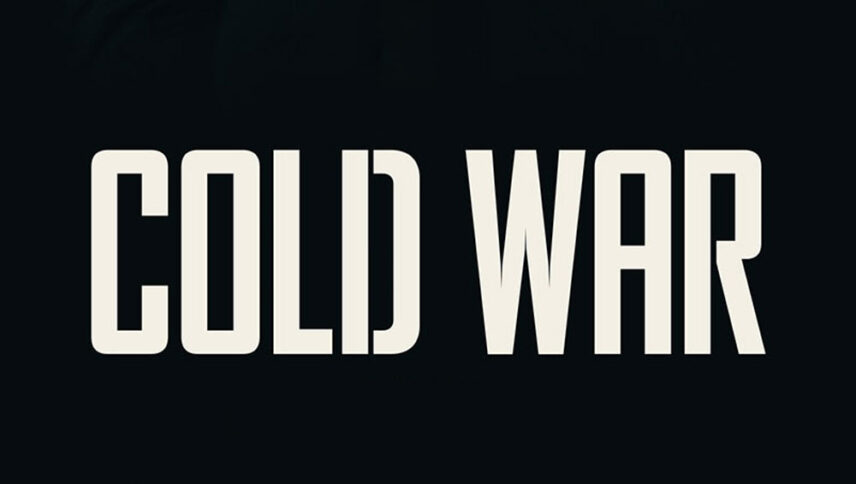
What font is used in the Cold War logo?
I did a lot of research to find the font used in the Cold War logo. I didn’t find the exact font used in the logo. Most likely, this font has been personalized.
Anyway, I found two fonts that are very similar to the original logo font. The first is premium and the second is free. You can manipulate these fonts a bit to make them look like the desired font.
The first font is “S&S Amberosa Sans 2” and was designed by Gilang Purnama Jaya and published by Spencer & Sons Co. This font is Premium and you can buy it from the link below.
The second alternative font is “Big Noodle Titling ” and was designed by Sentinel Type. You can use it in your personal and commercial projects. Click on the button below to download it.
When it comes to war-themed movies or the world war, many expect to use a harsh military font to illustrate the difficulties of that time. But the Cold War movie’s logo font, with a slight difference, turns the space into a soothing music symphony, and the letters with smoothed edges reduce some of the hardships of war. If you are looking for a font for a logo or a collection of military games and movies, it is better to think of similar examples of this font.
About the Cold War
The torn curtains of love are the new mystery-themed, visually appealing, and musically thematic film by Paul Pavlikowski, which takes place during and after the Cold War in Poland.
Black and white cinematography is still showing itself here, especially in moments when you are about to feel dark, and these dreamy moments are well displayed on the big screen. This is an episodic story of between imprisonment and escape, and it has a huge scope
In Poland in the late 1940s, as the flames of the Cold War slowly subsided, a musician and a reporter with their equipment were trampling on various villages to listen to local folk songs and In the meantime, they hope that a young couple will pass by so that they can use them as dancers while playing these local songs.


