Dark Series Font

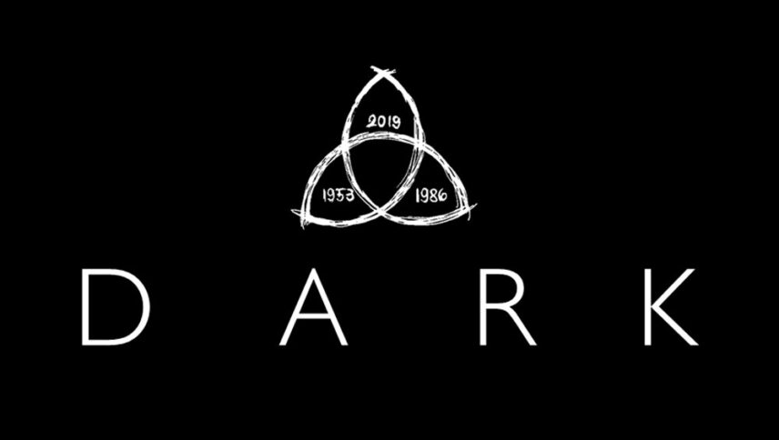
What font is used in the Dark logo?
“Gill Sans Light” is the font used in the Dark series logo. This font is designed by Eric Gill and published by Monotype. You can purchase this font from the link below.
If you do not want to buy this font, we have also provided a free and alternative font that is very similar to the original font.
This font is “Petita” designed by Manfred Klein. You can use this font in your personal and commercial projects. Download and enjoy this font from the link below.
Dark is a crime series in which they look for missing bodies, and of course, considering the timing of the move, it is considered a futuristic film. But its connection to the series logo font is very clear and simple. The font has a future style and depending on the spacing of the letters, the time interval, and how or what they are looking for at this distance. You must have been selected for movies or series with this genre to design its logo font.
About Dark Series
Netflix is at its best when it shows its true identity by making series that are popular, creative, twisted, unexpected, and controversial.
“Dark” is actually one of those one-act series, and the idea of the series is that “Time” is a higher priority than “Place.” what does it mean? In stories where the driving force behind missing persons is, the question is, “Where is the missing person?” But in “Dark” as soon as the corpse of a child in his eighties is found, in 2019, and as soon as one of the children living in 2019 turns eighty, he encounters a youthful copy of his parents. We know we have to change the question. Now we have to ask, “When is the missing person?”.


