Ray-Ban Font
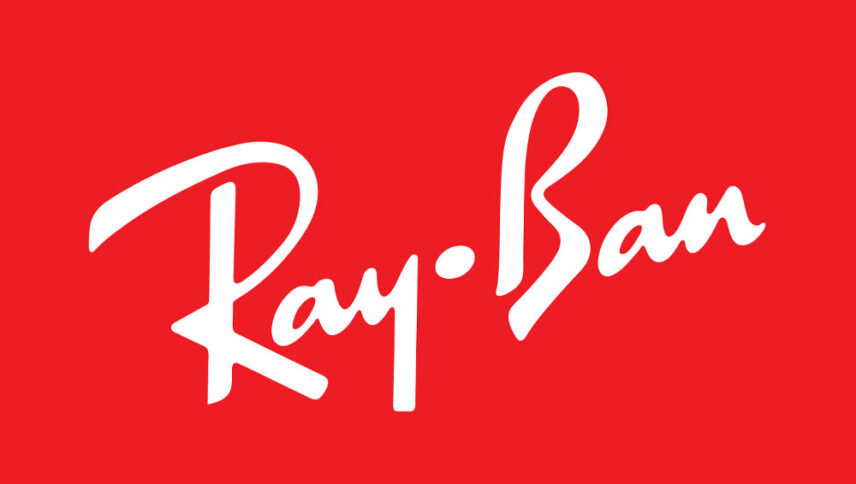
What font is used in the Ray-Ban logo?
I did a lot of research to find the font used in the Ray-Ban logo. I didn’t find the exact font used in the logo. Most likely, this font has been personalized.
Anyway, I found two fonts that are very similar to the original logo font. The first is premium and the second is free. You can manipulate these fonts a bit to make them look like the desired font.
The first font is “Kinescope” and was designed by Mark Simonson. This font is Premium and you can buy it from the link below.
The second alternative font is “Ben Brown” and was designed by Quick Brown Fox Fonts. You can use it in your personal projects. Click on the button below to download it.
The logo font of the Ray-Ban brand is very simple and attractive at the same time. This logo font is placed in a red rectangle with white color. The style of this font is similar to handwriting, and the fonts are placed inside this rectangle in the form of diagonal angels. This logo font is indeed used in pilot products for pilots, but due to its style, it is also used in many other areas, such as personal designs.
About Ray-Ban
In 1929, Col. John Andrew McRady, a U.S. Army Air Force Colonel, worked with Bausch & Lomb, a medical equipment manufacturer in Worcester, New York, to make a pair of sunglasses to reduce the distract pilots from the blue and white color was in the sky McRady, in particular, was worried when the pilot’s glasses were dark and cloudy, reducing the visibility at high altitudes.
The prototype of the Ray-Ban glasses, made in 1936 and known as the Anti-Glare, had plastic frames and green lenses that could eliminate glare without darkening or blurring one’s vision. A year later, Mark Ray-Ban’s glasses were designed with a metal frame and entered the market as “Aviators” pilot glasses.
The most common and well-known models are the Mark Ray-Ban glasses, the Ray-Ban Wayfarer and the Aviator. During the 1950s, Ray-Ban produced the Caravan model, which had a square frame.
