The Prestige Movie Font
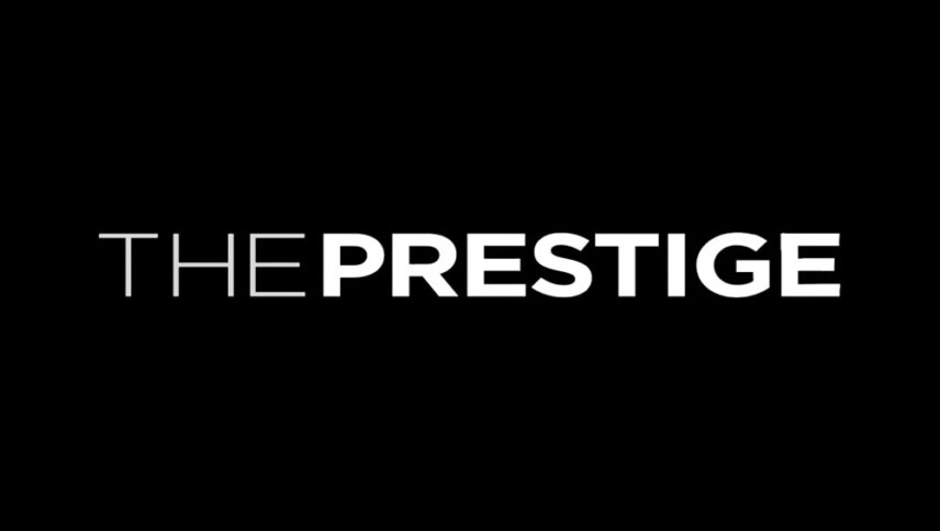
What font is used in The Prestige logo?
“Loew Next Extra Bold” is the font used in The Prestige logo. This font is designed by Jonathan Hill and published by The Northern Block Ltd. You can purchase this font from the link below.
If you do not want to buy this font, we have also provided a free and alternative font that is very similar to the original font.
You can use this font in your personal projects. Download and enjoy this font from the link below.
The world of magic is full of secrets and mysteries that are always hidden from the viewers. This has led many writers to write and reveal some of these secrets to viewers. We also want to reveal the secrets of the font of “The prestige” movie to you and tell you about its uses. This classy and wide font has a place in the posters of many movies and websites, as well as brands, and it makes the viewer’s eyes fade with the letters.
About The Prestige
“The prestige” can be considered one of the best narratives made by Christopher Nolan in Hollywood cinema, Amazing and informative storytelling that not only succeeds in presenting one by one the principles of the narrative structure of popular American cinema.
The film deals with magicians who, due to a bitter and unintentional event, become each other’s bloody and eternal enemies, and always to achieve another position and destroy the other side, from nothing. Robert Angier and Alfred Borden, according to Nolan’s usual habit, are confronted with realistic decisions in most parts of the story that challenge their human nature more than anything else.
In the meantime, one of the things that have made “The prestige” such a colorful and influential work in Nolan’s career is his proper use of many scientific elements in the path of his crazy storytelling.
