Better Call Saul Font
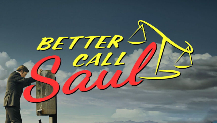
What font is used in the Better Call Saul logo?
Two different fonts are used in this logo. The names of these fonts are “Dancing Script” and “Script1 Script Casual”.
You can use both of these fonts in your personal and commercial projects. Easily download them by clicking the button below.
The logo of the “Better Call Saul” series is a combination of images and text. The image, which is clearly about judgment and decision, is embossed with the theme of secrecy and mystery of the story of each episode of the series, and it can be said that this image is designed with the same pen as the text of the “BETTER CALL” text. The other text, Saul, is designed with a font in the handwritten style that refers to the main character of the series. You are faced with three types of logo fonts that you can use in advertising, family and friendly texts, as well as crime movies in which the lawyer plays an important role.
About Better Call Saul
Well, all you have to do is go to “Breaking Bad” or you will hear the name of a prodigy named Vince Gilligan. As soon as you know that there is a trace of this special, exceptional and thought-provoking work in the series Better Call Saul, it will probably convince you to watch it.
The interesting thing about “Better Call Saul” is the close relationship it has with “Breaking Bad.” Not just because both products use common characters, but more from a hypertext perspective. There is a connection between the two works of Vince Gilligan that greatly influences “Better Call Saul” than “Breaking Bad”.

