Get Out Font
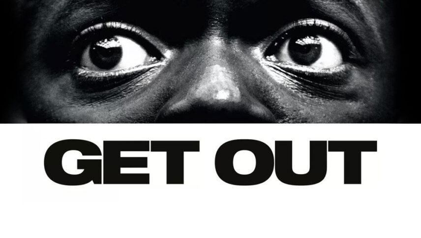
What font is used in the Get Out logo?
“Neue Helvetica Pro 93 Extended Black” is the font used in the Get Out logo. This font is designed by Max Miedinger, Edouard Hoffmann and published by Linotype. You can purchase this font from the link below.
If you do not want to buy this font, we have also provided a free and alternative font that is very similar to the original font.
This font is “Archivo Black” designed by Omnibus Type. You can use this font in your personal and commercial projects. Download and enjoy this font from the link below.
When you want to write a sentence with all reality in writing, it certainly doesn’t use fonts with thin and small lines. It uses a lot of distance absorption. So now that you’re familiar with the concept, you’re probably guessing that the “Get Out” movie logo font will be used for billboards and stand-alone advertising designs in subways and stores.
About Get Out
“Get Out” is a horror film, but not one of those horror films that have hit theaters in recent years. First of all, I have to say that the age rating of the movie is R (over 17 years old), and that means watching things that are not found in horror movies over the age of 13.
“Go Out” does not go directly into the realm of a satirical or comedy film; in fact, the seriousness of the film does not allow it. But with these interpretations, it cannot be said that it does not take on this tone at any moment. Several other unexpected scenes will surely shock you, such as one of the scenes adorned with corner music. Perhaps this film can be called the equivalent of screaming. The filmmaker did not want to engage the viewer with relentless tension and anxiety. However, it is not surprising that “Peel” made a film like “Get Out”.
