Leon: The Professional Font
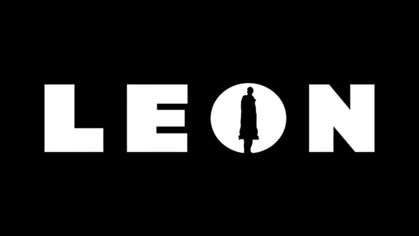
What font is used in the Leon: The Professional logo?
I did a lot of research to find the font used in the Léon: The Professional logo. I didn’t find the exact font used in the logo. Most likely, this font has been personalized.
However, I have found a font that is free and very similar to the font used in this logo. You can use this font in your personal projects. Click on the button below to easily download it
The font style of the “Léon the Professional” is with a different and exciting style, which is smooth in some of the edges of the letters and others like the blading. And if you’ve seen the movie, it’s a mix of action and romantic scenes, and that’s why there’s no violence in all the characters. The distressed style allows designers to use it for action movies, as well as brands and urban and construction ads.
About Leon the Professional
We all have favorite movies that we are fascinated by for a specific reason: they are movies that have made us fall in love with cinema. There is no such thing as negative and weak meaning about these films. Léon the Professional, which narrates the friendship of a murderer and a lonely girl, is known as one of the best action movies in the cinema.
The formula and structure of Leon’s storytelling is not complicated at all. This means that if you read the synopsis of the film, you will probably expect a typical cinematic experience. A cliché movie. But the reality is different. Not only is Leon not a cliché, but with this simple storyline, he achieves great things. We are talking about an action. But “Leon” is a successful combination of several different genres and styles.
