Mad Men Font
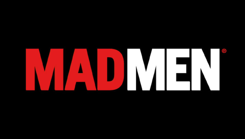
What font is used in the Mad Men logo?
“Neue Helvetica Std 87 Condensed Heavy” is the font used in the Mad Men logo. This font is designed by Max Miedinger, Edouard Hoffmann and published by Linotype. You can purchase this font from the link below.
If you do not want to buy this font, we have also provided a free and alternative font that is very similar to the original font.
This font is “Opti Alpine” designed by OPTIFONT. You can use this font in your personal projects. Download and enjoy this font from the link below.
When it comes to “Mad Men”, I remember “Mad Max”. It’s true that the content of the films is not the same, but for many font designers, the two films are very similar, except for the effects.
The choice of a well-known and distressed font in this movie is due to the fact that the concept of the film has good middle-class advertising, and this font is made exactly for this purpose. In many billboards, newspapers, and flyers, such a font attracts the audience with a loud voice. Why not use this font to make a lot of sounds?
About Mad Men
Writing about the lovely drama “Mad Men” made by the AMC television network has always been a source of entertainment for critics. One of the main reasons why this series is so attractive to its fans is the way the series uses it to tell its stories.
For many years, one of the main themes of “Mad Men” has been changing men and women in a period of time in which the series takes place, and this element becomes stronger with the start of the final season. Peggy, Joan, Roger, and Dan all feel that they are in a turning point that they must have either achieved or achieved in the past.
