Rick and Morty Font
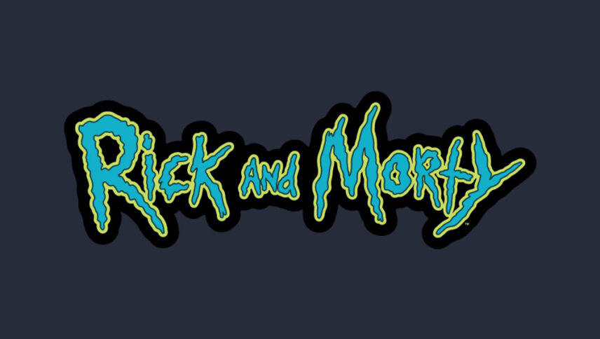
What font is used in the Rick and Morty logo?
I did a lot of research to find the font used in the Rick and Morty logo. I didn’t find the exact font used in the logo. Most likely, this font has been personalized.
Anyway, I found a free font that is very similar to the font used in the original logo. The name of this font is “Get Schwifty” and it was designed by Jonizaak. This font is completely free and you can download it for free by clicking the button below. You can use this font in your personal and commercial projects.
The font of the cartoon’s logo of “Rick and Morty” can mostly be said to be derived from the work of the two main characters of the story to discover the truth, and given their vibrancy, it can be said to have an electronic style, and this style turns into crazy lines with a cartoonish atmosphere. This logo font can be used in the brand of galactic toys, cartoons and many more.
About Rick and Morty
One of Sitcom’s comedic animations, released in 2013, is Rick and Morty.
Personally, the first thing that made me fall in love with Rick and Morty was the “horrible” part of Morty and his grandfather’s travels. Yeah, at first glance Rick and Morty don’t look terrible. First, because we’re talking about a ridiculously grandiose comedy that derides even its most serious moments, and second, it’s even more important because “Rick and Morty” don’t make familiar fright. Rick and Morty deal with sci-fi horror.
In general, science fiction people are portrayed as the center of existence. Humans are always at the forefront of the fight against space aliens or discoveries. There’s something in “Rick and Morty” and the effects of the cosmic horror. “Cosmic cynicism” conceives of a world without us, describing existence as an inhuman and indifferent place to human hopes, desires, and struggles.
