Six Feet Under Font
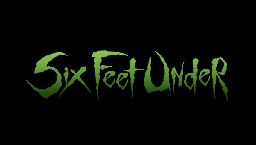
What font is used in the Six Feet Under logo?
I did a lot of research to find the font used in the Six Feet Under logo. I didn’t find the exact font used in the logo. Most likely, this font has been personalized.
However, I have found a font that is free and very similar to the font used in this logo. The first font is “Get Schwifty” and was designed by jonizaak. You can use this font in your personal and commercial projects. Click on the button below to easily download it
Whenever we talk about the few feet under, we all remember the cemeteries. This time Six feet Under is about the cemetery, and the font of the logo completes the concept with just one simple horizontal line because the words are below the line, and that means we’re dealing with concepts like death and cemeteries. The style of this series is classic and fortunately, by downloading this font, many doors have been opened for you to complete your semi-finished projects.
About Six Feet Under
The Six Feet Under series, produced by HBO Cable Network, aired five seasons between 2001 and 2005. The first thing that comes to mind when you hear the name of the cable network is that there are no restrictions in the series.
The subject of the series is about a family whose job is to hold burial ceremonies, and of course, the main theme of the series is death. From the beginning of the story, the audience realizes that they are not on the side of an ordinary family. The father of the family dies in a car accident in the very first episode. The eldest son of the family, who is due to return home for the holidays, is shocked by his father’s death and suffers a severe psychological trauma, under the pretext of continuing his family business with his brother …
