The Conjuring Font
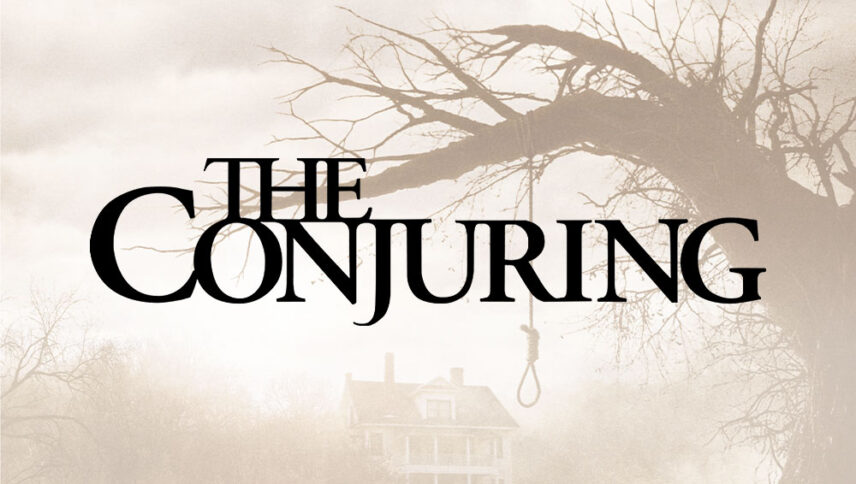
What font is used in The Conjuring logo?
I did a lot of research to find the font used in The Conjuring logo. I didn’t find the exact font used in the logo. Most likely, this font has been personalized.
Anyway, I found two fonts that are very similar to the original logo font. The first is premium and the second is free. You can manipulate these fonts a bit to make them look like the desired font.
The first font is “Adobe Garamond Pro Semibold” and was designed by Robert Slimbach, Claude Garamond, Robert Granjon and published by Adobe. This font is Premium and you can buy it from the link below.
The second alternative font is free and you can use it in your personal and commercial projects. Click on the button below to download it.
When you look at texts such as the font of The Conjuring logo font, it makes you notice about not having space between the letters. This is just for the sake of being intense and hard to evoke moments of panic and showing that the spirits are very close. This logo font is like a typewriter that used to type a lot of text in the past. You can use this font in the headlines of mysterious and scary movies, scary themes like Halloween and writing books or remaking novels like old texts.
About The Conjuring
Wan is a young director who has learned a great deal in the past few years to scare the audience and does so in the best way possible. In “The Conjuring” Wan, in a sense of suspense upon the arrival of the Peron family, invades the audience, always keeping the audience in a state of stress, and conveying the horror to the audience by whatever means and trick they wish. This is not a common occurrence in Hollywood horror films.
The ghost story is about a large Peron family who moved to a large but old house in Harrisville, Rhode Island in 1971, to live a quiet life together with their five daughters, Soon the Peron family finds out that this house is being controlled by an unknown power…
