The Platform Movie Font
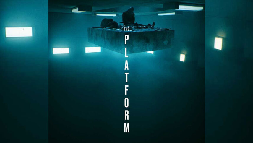
I found a lot of fonts that are very similar to the fonts used in the Platform movie logo. Anyway, I’m going to introduce you to just two fonts, the first one is premium and the second one is free.
The first font is “Coolvetica Compressed Heavy” and designed by Ray Larabie and published by Typodermic. This font is Premium and you can buy it from the link below.
The second alternative font is free and you can use it in your personal projects. Click on the button below to download it.
What a great idea to put the letters of The Platform logo font vertically that fit in with the main theme of the film, namely in a prison where there are different levels and each level has its character. The height of each letter indicates the high altitude that separates each floor and makes it almost impossible to reach other levels. You can use fonts for other films and different styles, such as place horizontally and placing rooms on one floor. Or use it entirely in tourism flyers that have nothing to do with filmmaking.
About The Platform
From the film “We” to the Academy Award-winning film “Knives out” and “Parasite”, 2019 has been at the center of many genres and theaters and discourses. The platform, meanwhile, is a Spanish film directed by Galder Gaztelu-Urrutia and co-written by David Desola and Pedro Rivero.
Multi-level prisons have one cell on each floor. In this prison, one platform only feeds prisoners from top to bottom once and only two minutes a day and inmates on the upper floors receive better food.
One of the most interesting things about The Platform is that inmates vary from inherent violence to accidents and people like Gaurang, who voluntarily enter prison. The viewer encounters a political buffet based on class structure, which is strange.
