Twin Peaks Font
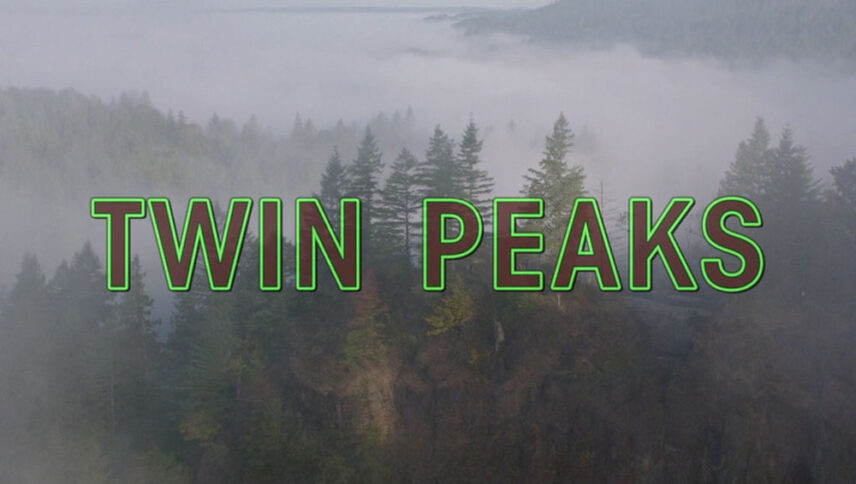
What font is used in the Twin Peaks logo?
“National Gothic” is the font used in the Twin Peaks logo. This font is designed by OPTIFONT. You can use the font in your personal projects. Simply download it from the link below.
The golden color is reminiscent of valuables such as gold, diamonds, and luxury items. But there are also things in nature that are worth as much as gold. Like two imaginary mountain ranges, the name of the “Twin Peaks” series and the logo font is in golden style. The effect of this logo font is exactly the same as that of gold ingots that are struck by light and create diagonal lines. Your hand is open to creating different works and concepts of gold, and by brainstorming, you can turn this font into silver or bronze and use it in jewelry stores, fantasy and fantasy movies, and much more.
About Twin Peaks
The most important reason for the success of Twin Peaks is the main factors in its construction. David Lynch, the director, and theorist of cinema who is probably familiar with his surreal movies is directing the series and its ideas.
It all starts in an imaginary city called Twin Peaks in Washington state. Where a girl named Laura Palmer is killed and her body wrapped in plastic is pulled out of the river. Pete Martel has found her. A member of the Martel family, who had gone fishing nearby, dries up when they see the body on the riverbank. He calls the local police station and finds that the body of a young girl has been found.
