Three Billboards Outside Ebbing, Missouri Font
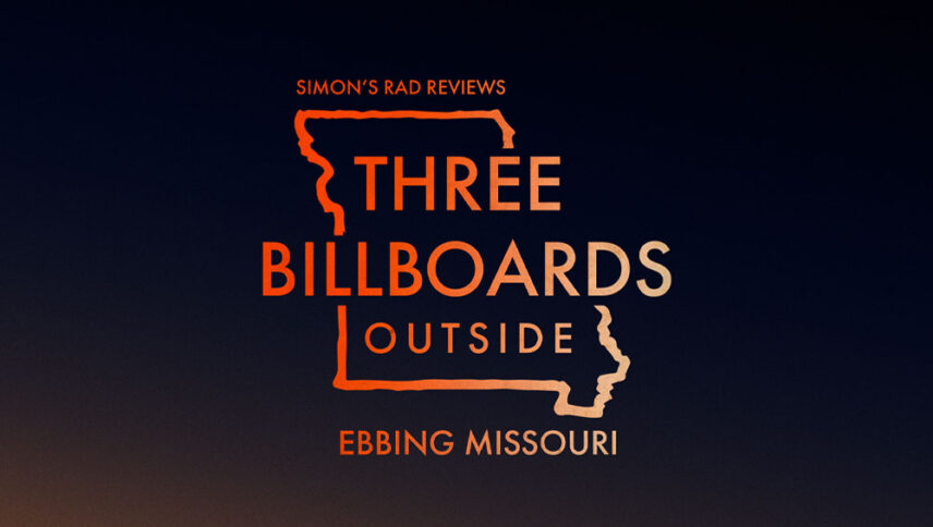
What font is used in the Three Billboards Outside Ebbing, Missouri logo?
“Futura ND Medium” is the font used in the Three Billboards Outside Ebbing, Missouri logo. This font is designed by Paul Renner, Marie-Thérèse Koreman and published by Neufville Digital. You can purchase this font from the link below.
If you do not want to buy this font, we have also provided a free and alternative font that is very similar to the original font.
This font is “Biko” designed by Marco Ugolini. You can use this font in your personal projects. Download and enjoy this font from the link below.
Because the title of the “Three Billboards Outside Ebbing, Missouri” is long, and if a font is used, it will cause uniformity. The designers have used three fonts, as well as the logo that is the map of Missouri. The “Three Billboards Outside” font is in a broad, billboard-style. For Ebbing, the handwritten yoke is used, and in the end, a farming style is used for Missouri. Now it is up to you to choose which of these three fonts to download and use in your next projects.
About Three Billboards Outside Ebbing, Missouri
Sometimes, in the world of cinema, instead of watching amazing stories or unknown stories, we watch movies that, second by second, we can praise the visual form and power of their narrative. I mean, for example, in the opening moments of “Three Billboards Outside Ebbing, Missouri” the audience is confronted not with a strange and questionable shot, but with a picture of our world.
The story may be about a mother who lost her child and now wants to use her billboards and three billboards to get the attention of the police and the people of the city to her case again, but the reality is that the movie is about how to tell this story.
