Reader’s Digest Font
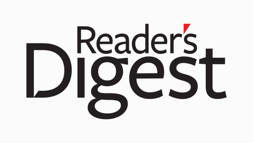
What font is used in the Reader’s Digest logo?
I did a lot of research to find the font used in the Reader’s Digest logo. I didn’t find the exact font used in the logo. Most likely, this font has been personalized.
Anyway, I found two fonts that are very similar to the original logo font. The first is premium and the second is free. You can manipulate these fonts a bit to make them look like the desired font.
The first font is “Stella Osf” and was designed by Mário Feliciano and published by Feliciano. This font is Premium and you can buy it from the link below.
The second alternative font is “Martel Sans” and was designed by TypeOff. You can use it in your personal and commercial projects. Click on the button below to download it.
The only thing that attracts me and maybe your audience to the cover of the magazine is how to design its logo font. The Reader’s Digest magazine logo font designed as a fun puzzle. In the word “reader’s”, the epistrophe can be exactly in the gap in the word digest, and that being a wrist indicates that it can become a good friend of yours.
About Reader’s Digest
The American General-Interest Family founded in 1922 by DeWitt Wallace and Lila Bell Wallace.
For decades, the magazine’s format included 30 articles in each issue, along with a vocabulary page, a page from “Amusing Anecdotes” and “Personal Glimpses”, two features of hilarious stories called “Humor in Uniform” and “Life in these United States”.
Each article preferred by a small, simple line. However, in recent years, this format became an impressive and eye-catching graphic everywhere. And many short data intertwined with complete articles.
International versions have made Reader Digest the best-selling monthly magazine in the world. Its global circulation, including all versions, reached 17 million copies and 70 million readers. Reader Digest is now available in 49 versions and 21 languages and is available in 2008 in more than 70 countries, including Slovenia, Croatia and Romania.
