It’s Always Sunny in Philadelphia Font
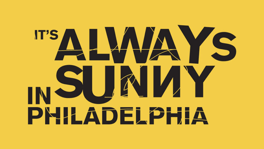
What font is used in the It’s Always Sunny in Philadelphia logo?
“Loew Next Arabic Heavy” is the font used in the It’s Always Sunny in Philadelphia logo. This font designed by Jonathan Hill and published by The Northern Block Ltd. You can purchase this font from the link below.
If you do not want to buy this font, we have also provided a free and alternative font that is very similar to the original font.
This font “Montserrat” designed by Julieta Ulanovsky. You can use this font in your personal and commercial projects. Download and enjoy this font from the link below.
The placement of the word “sunshine” among other words with a distinctive yellow color clearly shows that the font of the “It’s Always Sunny in Philadelphia” logo has well conveyed its meaning in terms of color. The logo font style is in the form of handwriting as if personal events like these 5 people are happening. And since the letters are Italic, In other words, it means that these events are different paths and are not always good and clean and without problems. What story would you like to turn into a sitcom comedy or have a comedy plot? Whatever it is, this logo font is suitable for such .
About It’s Always Sunny in Philadelphia
The “It’s Always Sunny in Philadelphia”, directed in 2000 in the comedy genre. The series is incredibly funny. The original creator of this collection is Rob McElhenney. The idea behind the series, which originally intended to be a short film, was to tell a man that he had cancer because he could borrow some sugar from his friend.
However, Good taste has no meaning for the characters in the series. They didn’t even care what they served at the Paddy Bar. In addition, the characters of this series should consider as characters who have no boundaries and can do any crazy thing.
