Pan’s Labyrinth Font
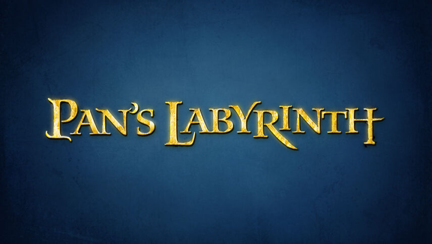
What font is used in the Pan’s Labyrinth logo?
I did a lot of research to find the font used in the Pan’s Labyrinth logo. I didn’t find the exact font used in the logo. Most likely, this font has been personalized.
Anyway, I found two fonts that are very similar to the original logo font. The first is premium and the second is free. You can manipulate these fonts a bit to make them look like the desired font.
The first font is “Waters Titling Pro Semibold” and was designed by Julian Waters and published by Adobe. This font is Premium and you can buy it from the link below.
The second alternative font is “CORMORANT” and was designed by Catharsis Fonts. You can use it in your personal and commercial projects. Click on the button below to download it.
The intertwined letters in the “Pan’s labyrinth” logo font are like the branches of a dry tree trying to grow on each side. The style of this font logo that attracts the audience is in the style of the elements of nature, and therefore everything related to nature, from florists and greenhouses to travel and tourism tours can use this logo font in advertising and flyers.
About Pan’s Labyrinth
From the moment the audience encounters the storytelling of Pan’s Labyrinth, the resemblance of the film to the best films of the genre as an undeniable and influential element in the creation of its minutes is clear.
The film, in the truest sense of the word, instead of breaking the archetypes and achieving something unseen, by showing the right combination of its components selected from the familiar elements of this genre of storytelling, and its special and attractive feature is the beautiful layout for which the filmmaker has prepared. It achieves the depth that the deconstruction film has achieved.
Del Toro’s work was not created to create a lasting model or a film by which directors learn how to innovate, nor to insist on adding unknown and new features to a large, important, and well-known genre, and instead of a classroom.
