The Good, the Bad and the Ugly Font
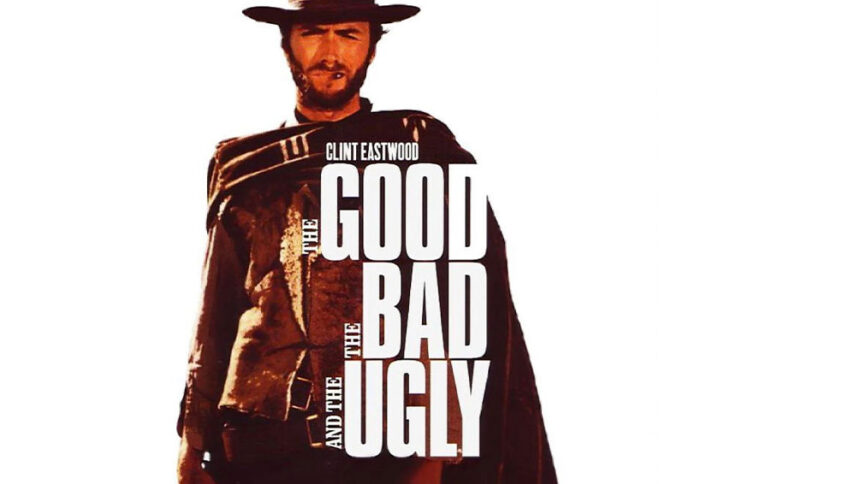
What font is used in The Good, the Bad and the Ugly logo?
“Compacta SH Regular” is the font used in The Good, the Bad and the Ugly logo. This font is designed by Fred Lambert and published by Scangraphic Digital Type Collection. This font can be purchased from the following link.
Also, I have two very good suggestions for choosing fonts similar to this font. See the list of Western Fonts and the list of Wanted Fonts right now. We chose the best fonts in this genre. We hope you enjoy them.
If you do not want to buy this font, we have also provided a free and alternative font that is very similar to the original font. You can use this font in your personal projects. Download and enjoy this font from the link below.
The Western world is always amazing for everyone, especially young boys, and the logo of the “The Good, the Bad, The Ugly” movie designed and put together with the Western world. This font infuses a sense of retro style and the rustic vibes of the Wild West. In the logo of trains, diners, western films and games, and tourism flyers, especially trip to the Wild West, what better way than leveraging some of the grungiest, coolest, and warmest western fonts like this.
About The Good, the Bad, and the Ugly
The Good, the Bad, and The Ugly is West Sergio Leone’s second film. His westerns, of Italian nationality, are known as “Western Spaghetti”, which has a mix of Italian and American culture and is more violent than its American counterpart. Leone depicts a special world of people who doubted between good and evil, truth and untruth, trust and mistrust, and killing and not killing each other for survival. He depicts three characters who are lonely and must fight to survive.
These three are three-dimensional triangles that seem to reach their climax and, of course, add to their unique skill and ingenuity by which they will survive and not die. Their behavior can be concealed in their mentality.
