Upgrade Movie Font
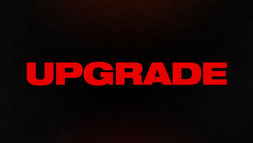
What font is used in the Upgrade logo?
“Neue Helvetica Pro 93 Extended Black” is the font used in the Upgrade logo. This font is designed by Max Miedinger, Edouard Hoffmann and published by Linotype. You can purchase this font from the link below.
If you do not want to buy this font, we have also provided a free and alternative font that is very similar to the original font.
This font is “Heading Pro Wide Heavy Trial” designed by Zetafonts. You can use this font in your personal projects. Download and enjoy this font from the link below.
Improving technology has always been a very good thing in people’s minds in the 21st century, but how far can it go without risks? As you can see in the Logo font Upgrade film, the poster theme is designed in red and black and the lines are abnormal, and this is exactly what is happening. Logo font with scary style means a warning. Of course, this font style can be very useful for many computer projects, warning texts in programs and many places.
About Upgrade
“Upgrade,” which may be considered the son of “Robocop” and “Payback,” is the latest work by Leigh Whannell. By moving away from the security fringe of working with James Wan, Vanel has been able to make good use of enough violence, bloodshed and bloodshed to prevent anyone from “Upgrade” with make a more serious science fiction movie. Like all B-grade works, this film creates pleasant moments while leaving aside the details and logic.
Although this is also the case in this film, it is just a starting point for the adventures of a man who has become a destroyer to avenge the death of his wife and his physical injuries. The film also incorporates some metaphors related to the science fiction genre, such as the general concept of highly artificial intelligence evolution.
