Midsommar Font
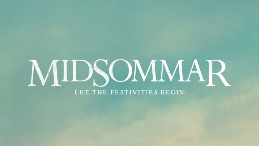
What font is used in the Midsommar logo?
“Perpetua Roman” is the font used in the Midsommar logo. This font is designed by Eric Gill and published by Monotype. This font can be purchased from the following link.
If you do not want to buy this font, we have also provided a free and alternative font that is very similar to the original font.
This font is “Oxford” and designed by Roger White. You can use this font in your personal projects. Download and enjoy this font from the link below.
Seeing the logo on the font makes the Midsommar film feel cheerful and good for many viewers, but after a little attention to how the letters are positioned that the uppercase letters have grown downwards rather than being rise up, indicating a difference. It is fundamental to the overall story. Given the gap between the letters, one can guess that the genre of this film is in a scary kind. You can also create or write the title of many movies and of course happy invitations or news with festive themes by playing with the letters and how to put them or use them.
About Midsommar
Ari Aster is a young filmmaker who was able to attract audiences and cinema experts by making the scary movie “Hereditary” last year. The director’s first feature film was so well-executed that many hoped for the emergence of a talented filmmaker. Aster has had many successes with Hereditary and now returns to the cinema to prove that the success of his previous work was no accident.
In the filmmaker’s earlier work, psychological problems caused an explosion within the main character of the story that somehow referred to human destruction from within. But in Midsommer, despite the introduction of a similar tragedy in which the protagonist of the story experiences a mental crisis, things are not going to explode from within!
