Paths of Glory Font

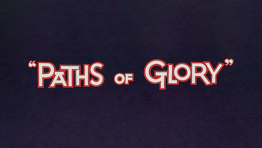
What font is used in the Paths of Glory logo?
I did a lot of research to find the font used in the Paths of Glory logo. I didn’t find the exact font used in the logo. Most likely, this font has been personalized.
However, I have found a font that is free and very similar to the font used in this logo. You can use this font in your personal projects. Click on the button below to easily download it
During World War I, there were many people who took many paths to make other people proud, and in 1957, a film with such a theme was made. In the movie “Path of Glory” logo font, the letters are very close together, almost like a path. Due to the unevenness of the font size, it can be understood that this way is very ups and downs. If you are looking for a font for the title of an epic movie or for animation with a war genre, you have taken the right path.
About Path of Glory
“Path of Glory” is Stanley Kubrick’s first major work. The film is an adaptation of a novel of the same name by Humphrey Cobb, which Kubrick wrote in 1957, and Kirk Douglas played on it.
The path of Glory is a film about humans and their relationships with each other in a context called war. Kubrick’s film shows that the phenomenon of war is devastating, even far from the battlefields.
Kubrick’s view of World War I is critical. He does not, of course, pay attention to the war itself, which is hostile or colonial, right, unjust, humane, or inhumane, but by focusing his gaze on one of the two opposing sides. It deals with issues in which rights, injustice, humanity, and inhumanity are clearly displayed.


