The Silence of the Lambs Font
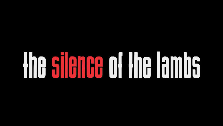
What font is used in The Silence of the Lambs logo?
“BStyle” is the font used in The Silence of the Lambs logo. This font is designed by Uwe Borchert. You can use the font in your personal and commercial projects. Simply download it from the link below.
The “The Silence of The Lambs” film’s font logo, like the main theme of the story, which deals with psychology, affects the letters and words, and with the different style that the font has, it also impresses the viewers, and with the magic that these words have, you can easily feel that fear. And he realized how violent it was. This font is used for many cinematic and promotional ideas and genres, such as horror, science, or psychopathic genres.
About The Silence of The Lambs
The film is based on the novel “The Silence of the Lambs” by Thomas Harris. The story of the film is related to Dr. Psychology, which can use the science of psychology to affect the environment around it and its human beings and easily master them. Few could stand in front of him. Despite his work, he was a freedom fighter and wanted to live like other human beings, but the police considered it very dangerous and tried to keep him in security prisons. He is also known for eating blood and in some cases cutting off facial skin, chewing the victim’s neck and veins.
The Silence of the Lambs, produced in 1991, was one of the best and most notable works in the horror genre. Dr. Hannibal Lexter with a good 15-minute performance by Anthony Hopkins, who won an Academy Award for his role.

