McLaren Font
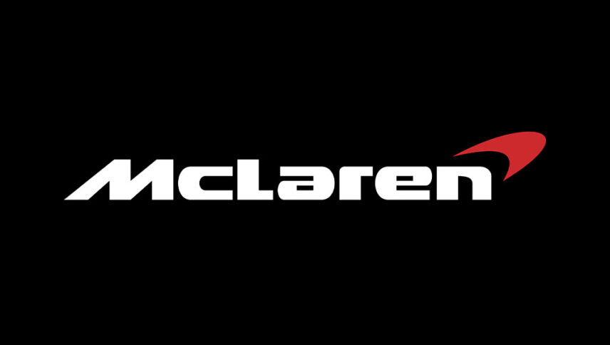
What font is used in the McLaren logo?
I did a lot of research to find the font used in the McLaren logo. I didn’t find the exact font used in the logo. Most likely, this font has been personalized.
Anyway, I found two fonts that are very similar to the original logo font. The first is premium and the second is free. You can manipulate these fonts a bit to make them look like the desired font.
The first font is “Moki Lean” and was designed by Marcus Sterz and published by FaceType. This font is Premium and you can buy it from the link below.
The second alternative font is “A Space” and was designed by Studio Typo. You can use it in your personal and commercial projects. Click on the button below to download it.
The first McLaren logo, which was the logo of the competition team, had a strange and questionable look. At the request of Bruce McLaren, a New Zealand birdwatch called the Kiwi was used to symbolize the team. Today’s McLaren logo font is different from the previous one and lacks a bird; But some special cars, such as the McLaren P1, have a design similar to a kiwi bird on parts of the propulsion to emphasize the manufacturer’s originality. In wordmark, the brand is a chubby font whose letter ‘M’ has an angle that indicates speed. This logo font is used in many food brands, heavy vehicles, car racing.
About McLaren
Unlike many British automakers, McLaren is not very old and original; But today it is one of the best manufacturers of sports models. McLaren has also had a strong presence in Formula One since its inception.
Today, McLaren is the best example of a top English carmaker that, like Italian brands, has a long history of speed racing.
From 2014 to 2016, McLaren made short animations related to its Formula One team. The main characters in the series, Tooned, are the drivers in the race, especially the McLaren team. Each episode, with an average duration of 3 minutes, was broadcast by the English Sky Sports Channel before the start of the match.
